My iPhone Setup
I was in the midst of a good discussion about aesthetics and simplifying the iPhone experience and in the process I took a screenshot of my home page to send out to make my point.
As I was explaining the reasoning behind my home page and why I keep it simple and sparse, I realized it would be a good example of the restrictions I’m purposely giving myself.
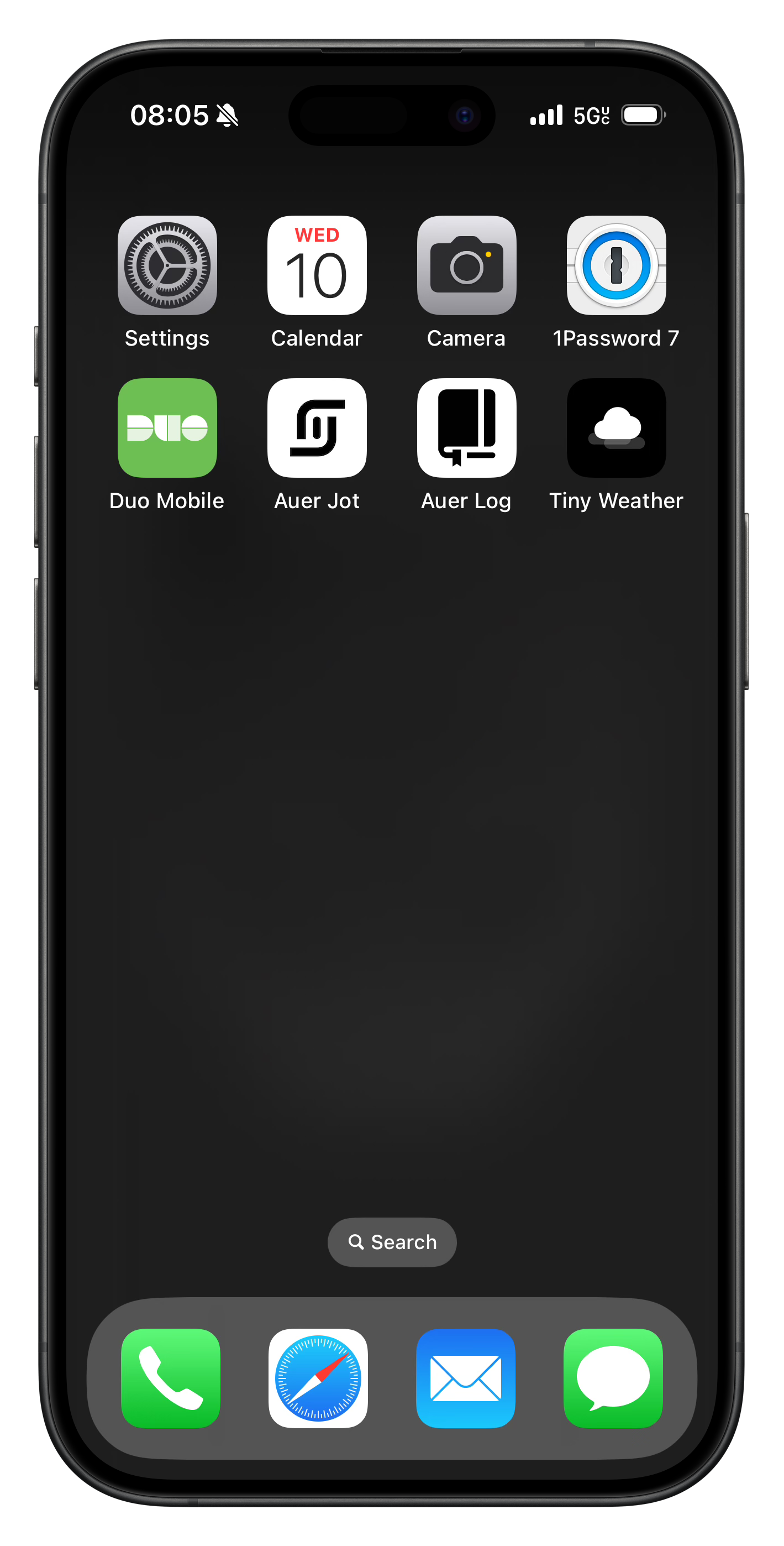
My current home screen:
The idea is to have a simple dark background, blurred when the phone is open, and only the applications I use daily here. Everything else is hidden and accessible when I need it by searching or swiping left to get to all apps in the phone (which are not that many more beyond these).
This simple approach does two things: allows me to quickly open what I use every day without having to search for it, and restricts me from spending unnecessary time on the device. As you can see the sound has been turned off, and I get no alerts on the phone. It's a quiet device.
The apps here are, in order of appearance:
- Settings: in there because I often use the phone to test applications and processes and I need quick access to settings - I'm thinking about removing this
- Calendar: quick way to see the date and I work with it every day
- Camera: yes, you can get to the camera by swiping in many directions, but I found it faster to get to it while I'm on the phone by going to the app directly from the home screen
- 1Password: password management
- Duo: my 2FA codes live there
- Auer Jot: my my brain dumps app
- Auer Log: I keep my habits there
- Tiny Weather: simple weather information that doesn't bother me
- Phone: for calls - huh... yes
- Safari: browser for the interwebs
- Mail: most of the work I do requires mailing, so...
- Message: my communication channel with friends and family
Simple and useful.
Updated
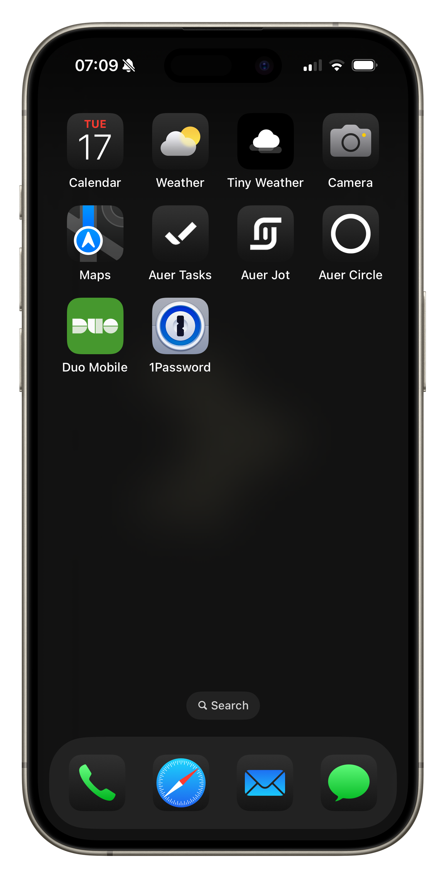
With the release of iOS 18 I had to post the new and much cooler home screen:
Beyond the dark theme, I added and removed some apps.
- Added Maps
- Added Auer Tasks
- Added Auer Circle, a soon to be released meditation timer
- Added Weather
- Moved Settings
- Moved Auer Log
Still minimal, still useful.

