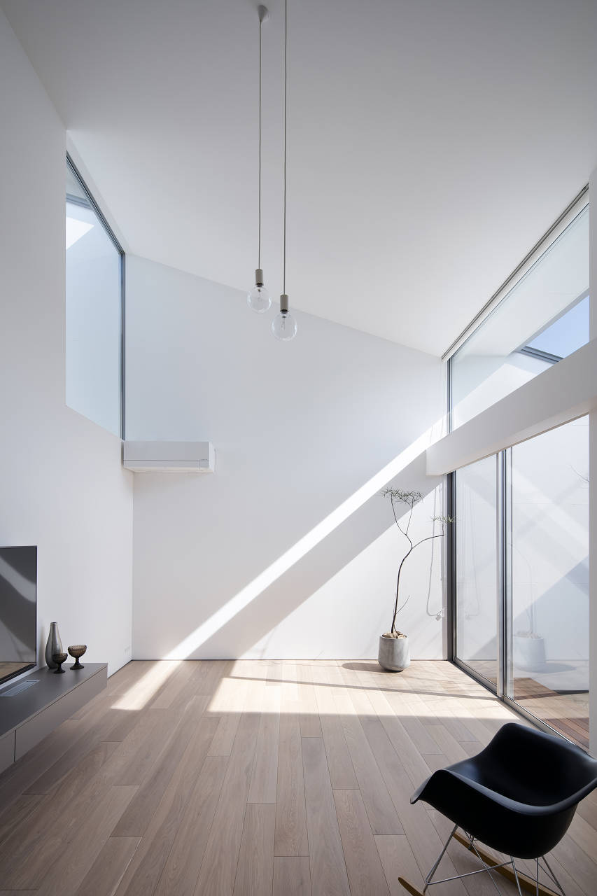
Observations On Simplicity
I was reading Minimalism and the Art of Photography and got me thinking about simplicity. Side note, I have a similar set up. I use a Fujifilm X-E3 with a 23mm lens. One camera, one lens.
I have been attracted to simpler objects, processes, and design in general for a long time. Simple approaches often lead to more successful outcomes, and the enjoyment of a job well done. Simple solutions and tools also lead to having to play with different ideas and ways of doing things, forcing you to be creative and intentional in what you do, and enabling some interesting thought processes to happen.
Simplicity is intentional. And because of this it’s a hard thing to achieve. Simplicity in design, the act of thinking through things in order to distill the essence and get rid of everything else, and the ability to bring that to life takes time, effort, and - often - several iterations to complete. At the risk of oversimplifying or even generalizing here, I think this is why today we are seeing that the simpler things are, the more expensive they tend to be.
When you have objects, such as cars, furniture, electronic devices, or utensils, and other non physical things like software, processes, or services, that are generally more expensive they tend to be simpler in their form, in their overall approach to how they work, and in what they actually provide (well, at least the ones that care). Yes, you are paying more for less, but what you are getting is higher quality (of materials and design), a smoother and slicker approach to things, and often a higher return, since the objects last longer and can also be appealing even when fashion or the current focus changes.
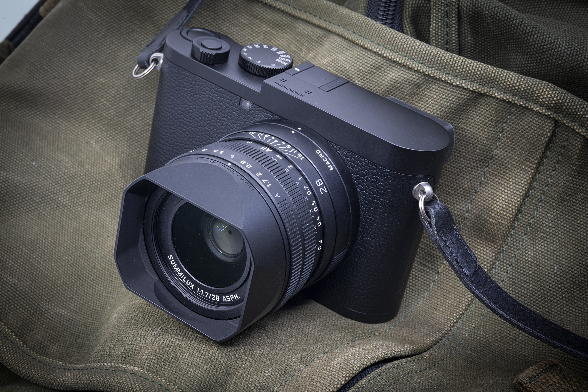
Leica Q2 Monochrome.
To me, simple lines rule. Purpose is king. Adding details to something "just because" makes no sense. Having a feature or detail added because it serves a purpose is the right approach. And yes, sometimes adding a flair here and there is good, but do it with taste keeping the design paired down. I mean, this is my opinion at least.
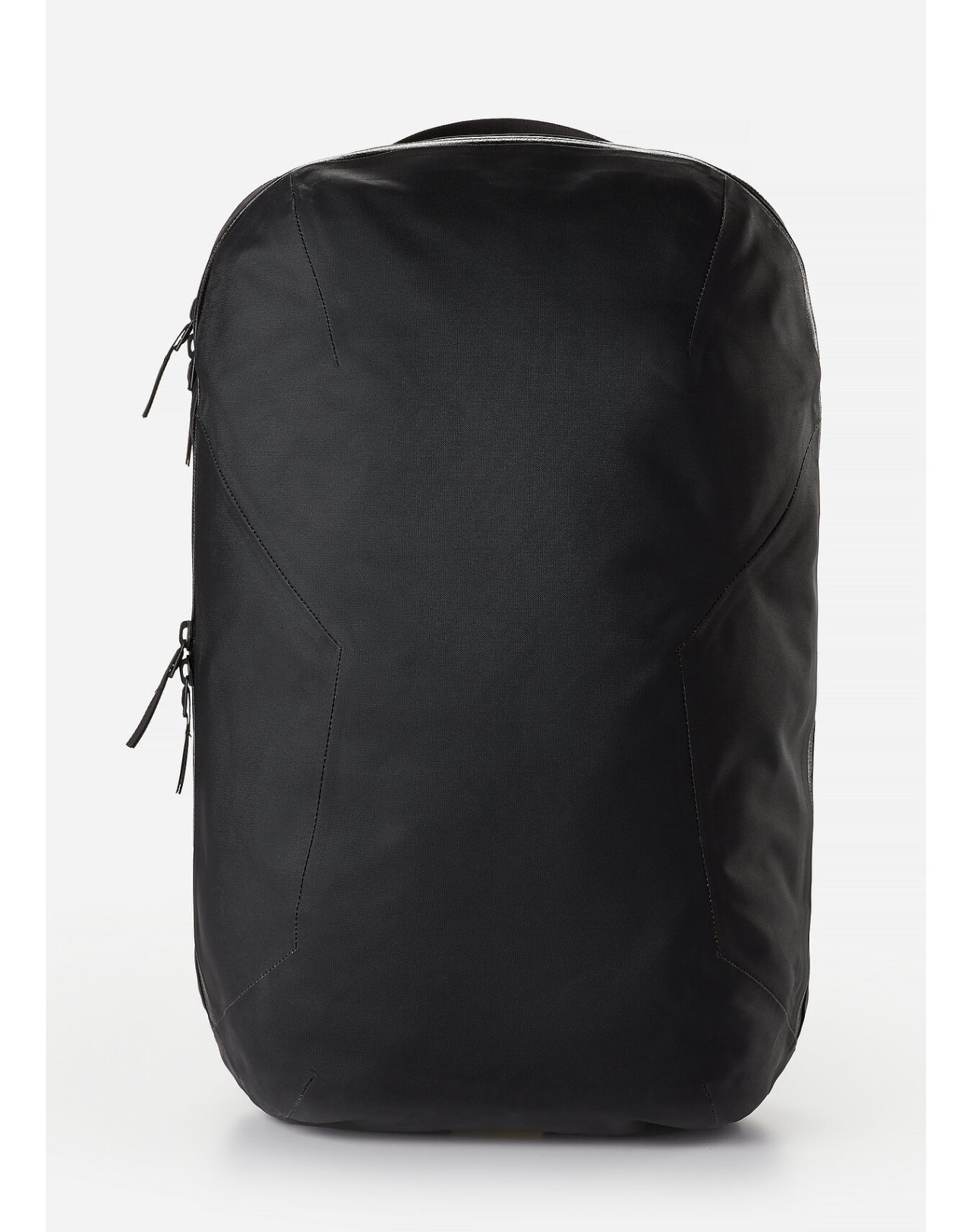
Veilance Nomin
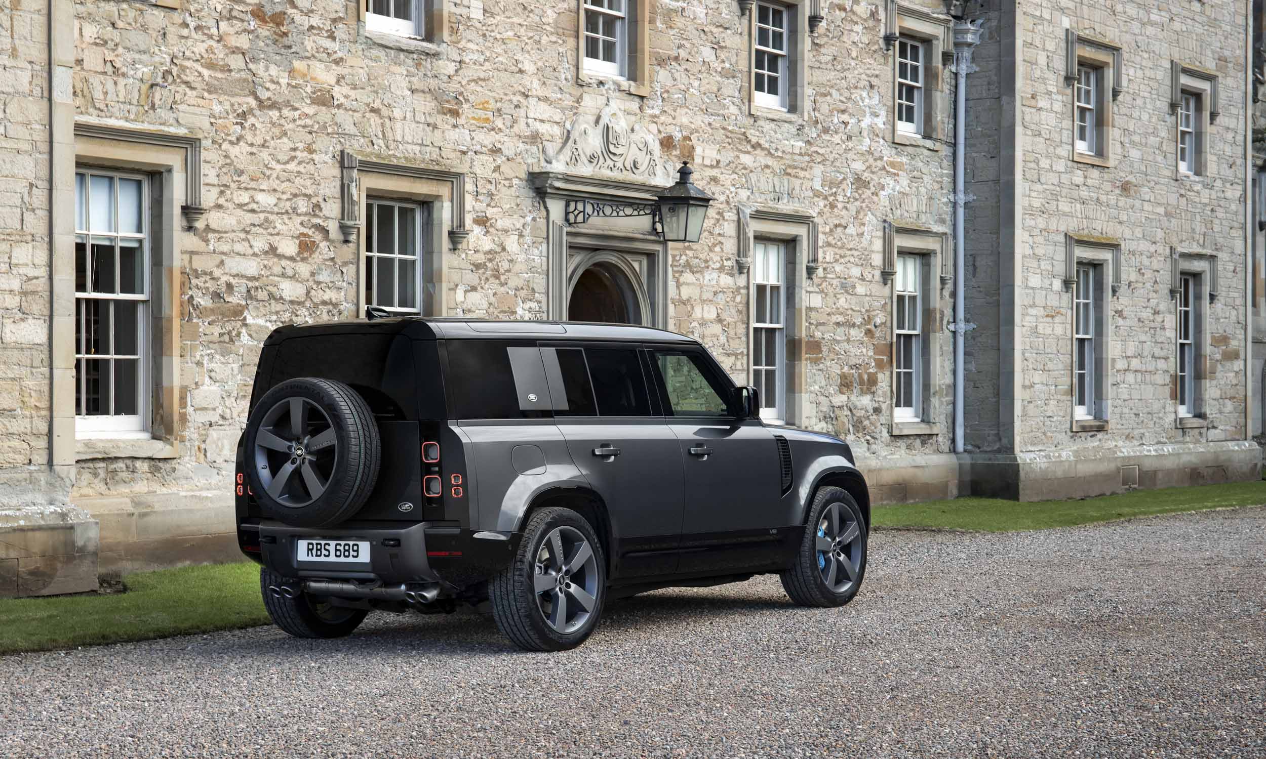
Land Rover Defender
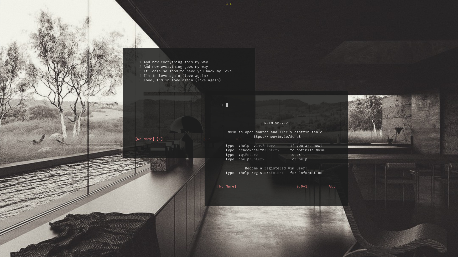
But think about it, if you create software and a way of working to go with it that is simple, usually single purpose, and minimized to the simplest approach possible, then you can continue to use that throughout the years. Now create a collection of those simple tools, and you can create complexity (as in solutions) out of simplicity that is still simple. Unix was designed that way, for example, and it has endured since the 1960s. There is a great write up about simple tools fostering complex uses that is worth reading.
Modern Linux desktop
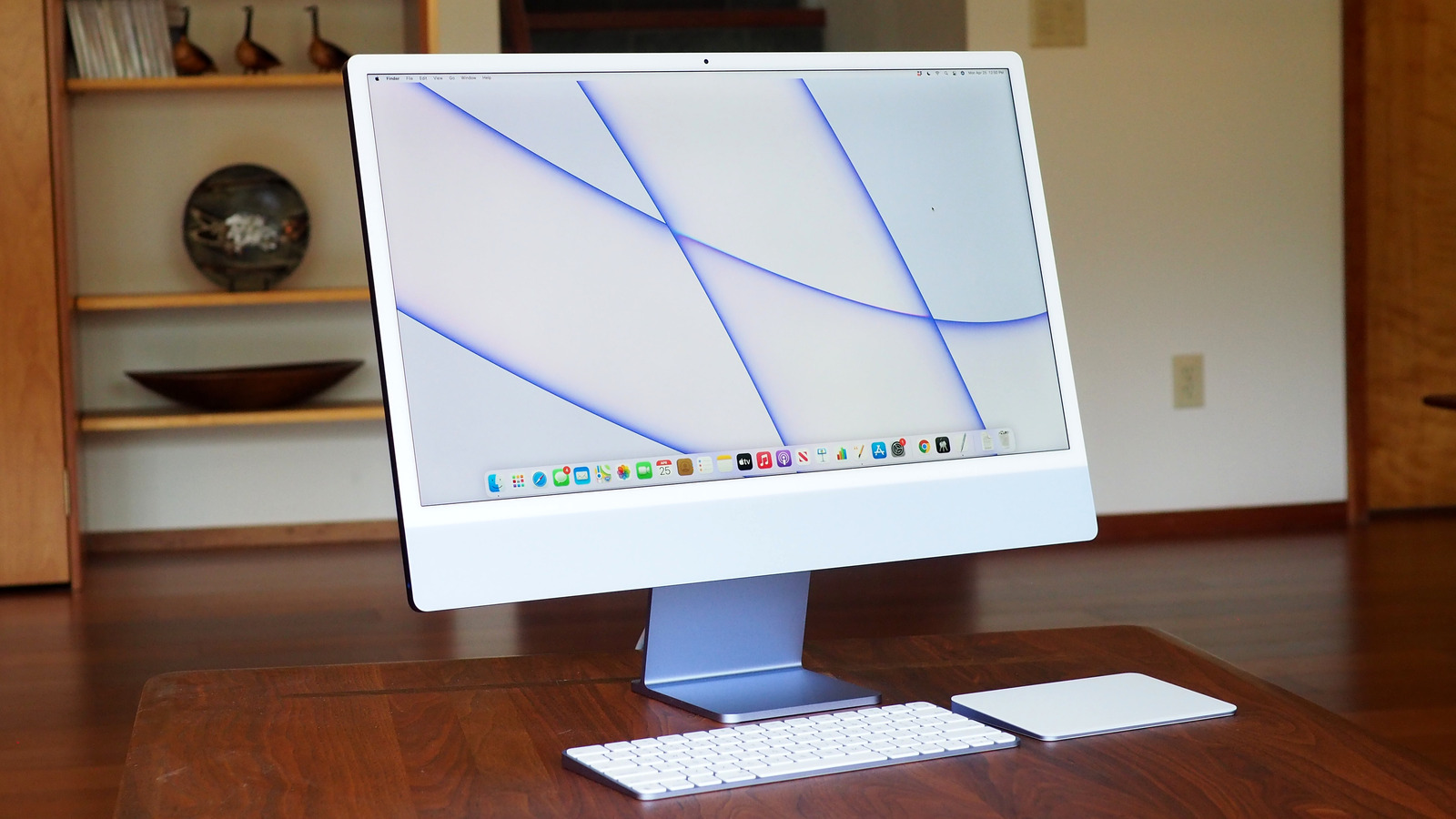
Apple has been famous for giving you less for more expensive hardware. When the PC manufacturers were adding more ports, features, grooves, buttons, and other stuff to their hardware, Apple always delivered toned-down designs, with slick surfaces, less everything, and yet more expensive. And with that came better quality of material, and attention to details. People switched because of this.
Apple iMac Desktop
I’ve been observing design trends for a while, and yeah, I think there is a pattern here that we can identify: cheap(er) things tend to add more for the sake of adding more just so they can cover the fact that they are cheap(er) or poorly designed. For example, cars have more unneeded chrome, details, and grooves; software adds more colors, buttons, and complexity; and other things become cluttered with unneeded elements that provide no real value.
I wonder if this is just me or others also think this way. Based on things I've read, more people are observing the same. There is a good book that shows you the process of adding until it sucks, and removing until it stops getting better (the process I use when creating something): The Simplicity Cycle: A Field Guide to Making Things Better Without Making Them Worse by Dam Ward. It's worth reading.
Tesla Model Y interior
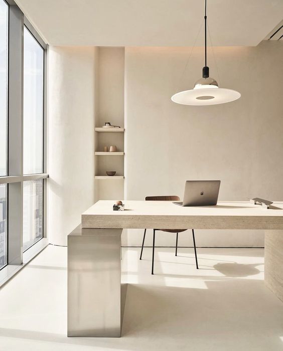
The more you look around, the more you see this pattern repeat itself. All across different industries and activities. And, often it’s not a matter of price or quality, but rather of long lasting vision, like a simple wooden cabin in the mountains: created with a simple purpose and with a simpler vision. Open spaces are the ultimate example of this, they are simple and they last.
I believe that simplicity leads to quiet and peace. When you don’t have to fight with a process, a process that is simple and understandable, then you lower the stress, you flow with the process, and you have more time to think about the things that are important. The same applies to visual clutter, I think. The simpler something is, the more its lines flow in a natural way, the less the assault on the senses, leading to a tranquil mind.
With that note, I’ll end.
